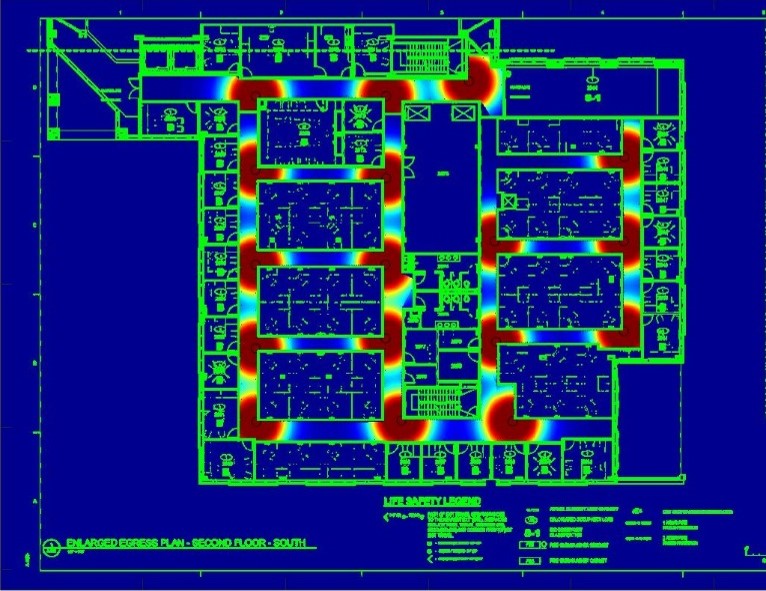
Engineer Research and Development Center - Environmental Laboratory

Risk and Decision Science Team

Artesion- Edge Computing

PARTNER

Artesion, Inc.

DESCRIPTION

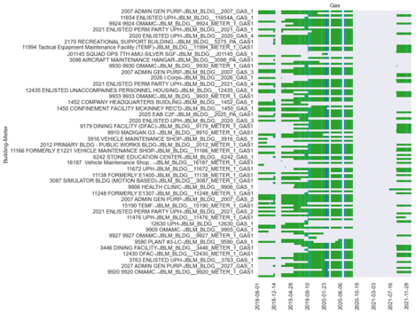
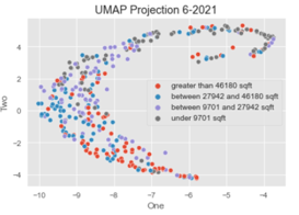
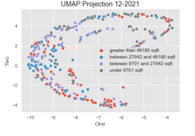
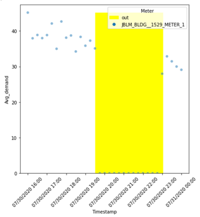
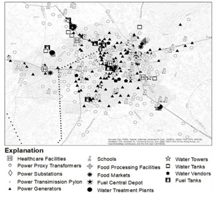
Infrastructure networks at military installations, such as power and water, are increasingly being integrated with cyber systems to improve visibility and control. At the same time, this integration can open these infrastructure systems up to new vulnerabilities and pathways for cascading failures. Therefore, this project has sought to develop methodologies for quantifying and strengthening resilience across different levels of cyber-energy systems, from ensuring resilient placement of sensors to examining the tradeoffs that edge computing can offer to balance efficiency and resilience. To bring these concepts together, the work has centered on developing a secure, zero-trust edge computing platform with the partner Artesion, Inc., that can allow federated data to be processed and delivered to end users even if normal networking services are disrupted. Results have been demonstrated at both Joint Base Lewis-McChord as well as ongoing work at Camp Humphries.


Problem

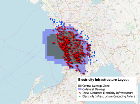
There are cascading impacts of complex interconnected systems. Below are some examples of issues arising from the Texas Polar Vortex of February 2021:

  • Electric demand shock
  • Decreased capacity from lack of winterization and supply of natural gas
  • Electric Reliability Council of TX forced to operate under emergency conditions until Feb. 19th, at which point 34,000 MW remained on forced outage
  • How should proactive resilience corrective actions and network design be implemented?
    • How should the cyber-physical energy system be accounted for in resilience implementation?
Upper graph is titled Notional Energy Systems Under Disruption(2). A key is give with a solid blue line for More resilient system, a dashed blue line for Less resilient system, and a solid grey line for Optimal system performance. The y-axis is labeled System Performance and the x-axis is labeled Time. A bold red arrow points down from the upper center with bullets reading Severe, weather event, Cyberattack, Transformer error, Demand shock, and Etc. A triple grey line runs horizontally through the middle of the graph. the solid blue line runs horizontally through the middle, then plummets after the event input, then recovers sharly and continues on the midline again. The dashed blue line follows the path of the solid blue but plummets further down and recovers much more slowly to eventually continue on the midline.  The lower graph is titled ERCOT Actual Daily System Load During the Polar Vortex Event. A key shows a solid blue line for Actual Daily System Load and a pink area for Unmet Critial Power Needs (approximate). The y-axis is labeled MW from 400,000 at the origin up to 1,600,000, increasing by 200,000 increments; and the x-axis shows dates from 2/4/2021 at the origin to 2/24/2021 and is incremented by 1 day intervals. The solid blue line begins at about 900,000 MW, sharply increasing 2/8 to about 1,420,000, dipping to 1,400,00o on 2/14, rising to about 1,500,000 on 2/15, then falling  sharply, recovering briefly, falling again, then leveling off on 2/21 just above 800,000. The pink area starts at 2/15/21 and surrounds the area abover the line and just below it in a large oval, then following the downward trend until 2/21.

A complex 3-D diagram shows a vertical double headed arrow on the left z-axis labeled Interoperability Layers, the x-axis is labeled Domains, and the y-axis is labeled Zones. Diamond shaped sections are layered vertically over each other with transparency. The bottom grey Component Layer has Domains labeled Generation, Transmission, Distribution, DER, and Customer Premesis. THe y-axis has Zones labeled Process, Field, Station, Operation, Enterprise, and Market. A green Communication Layer is just above with areas labeled Protocol. An orange Information Layer has ares labeled Data Model. A blue Function Layer has a harger area labeled Outline of Usecase and Functions with vertical lines connecting it to the topmost layer, the pink Business Layer with a large area lebeled Business Objectives Polit./ Regulat.. Framework.

Solution

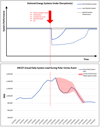
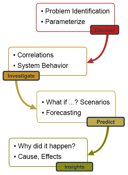
There is a clear need for System Resilience that encompasses ALL layers of cyber-energy systems.

  1. Energy Network
    Artificial Intelligence (AI) for Instillation Energy Resilience
    • Challenge: Complex systems, such as energy systems are often made up of component systems optimized in isolation specific for a domain
    • Goal: Development of a models to measure tradeoff between efficiency and resilience using AI and Machine Learning (ML)
    • Solution/Use of AI:
      • Principle Component Analysis (PCA) used to analyze complex behavior behind JBLM building power curves
      • We used results to inform data analytics for Energy management, Outages, and Climate Data for JBLM
Graphic of 4 staggered text boxes with smaller text boxes on colored fields, each pointing down tot he next. The top field reads -Problem Identification, -Parameterize. A smaller red Field reads Discover and with a red arrow pointing to the next. THe second text box reads -Correlations, -System Behavior with a smaller orange field reading Investigate with a yellow arrow pointing below. THe third box reads -What if ...? Scenarios, -Forecasting, with a smaller yellow field reading Predict and a green arrow pointing to the next below. Th fourth text box reads -Why did it happen?, -Cause, Effects and has a small green field that reads Insights.
A diagram of a floor plan on a deep blue background with bright green for the walls and shat appears to be hot spots that are marked with red circles edged in yellow generally at corners.
Efficient Sensor Placement

A diagram of a floor plan on a deep blue background with bright green for the walls and shat appears to be hot spots that are marked with red circles edged in yellow generally at corners.
Resilient Sensor Placement
  1. Sensing Network
    • Improving sensor coverage for resilience
    • Balance optimization between:
      • Maximum efficiency
        • No redundancy
        • 1 damaged sensor  missing data
      • Maximum resilience
        • Maximum redundancy
        • Damaged sensor is covered by backup
        • More sensors = higher costs
      • Sensor placement algorithm balances both efficiency and resilience
  1. Data Transmission
    • Ensuring Computing Resilience
      • Cloud Computing
        • Centralized
        • Single point of failure
        • Secure central servers
      • Edge Computing
        • Distributed
        • Redundant to single failure
        • Higher energy resource costs
      • Optimal deployment will balance the trade-offs between both configurations
Diagram showing a light blue cloud shape at the top, a white area with outlined text boxes in the center and a light blue rectagular area at the bottom with clipart images. Inside the top cloud shape is three images: a databse icon of stacked disks, a Processor icon with a settings icon on top, then a globe with a www banner for the web. They are labeled Database, Data Processing, and HTTPS, DDS, REST, etc. Above these three images are four text boxes reading, Control Modules, Query Services, Computation, and Analytics. The center white area has a blue bar heading reading API Service. On the left are three boxes, reading from top to bottom: Edge Computing, Network Layer, and Things Layer. On the right large area at the top is a square blue icon labeled Embedded Operating System, A cell tower icon labeled Gateway, and a Phone icon labeled Mobile Device. Just below is 4 rectangles reading Control Process (1), COntrol Process (2), Data Processing, and Control Process (n). Blue double-headed arrows connect below the 1st, 2nd, and 4th box to three sets of boxes below.  Just under Control Process (2) is Central Processing Unit (2) then Microcontroller Unit (2) then Sensors (2) and Actuators (2). Just under Control Process (n) is Central Processing Unit (n) then Microcontroller Unit (n) then Sensors (n) and Actuators (n). The lower blue has Power Generation With 6 icons above representing hydropower, steam power, wind power, nuclear power, oil power, and solar power. Then a section labeled Power Distribution Systems with images of power lines between poles and what appears to be drones. On the right is a section labeled Micro-Grid Systems with images of a security camera, a home with a solar panel, a home, a circle with pink and blue arcs, and a circular icon showing a home, sun, camera, lock, thermometer, and music note.
Spreadsheet image listing Building Meters on the left and Gas usage on the right from 08-01-2018, 12-14-2018, 04-28-2019, 09-10-2019, 01-23-2020, 06-06-2020, 10-19-2020, 03-03-2021, 07-16-2021, and 11-28-2021. Green bars show the amount of gas usage at leach location.
Map of metering availability (MDMS)

A scatter plot titled UMAP Projection 6-2021. The y-axis is labeled Two and is marked from -4 at the axis to 4 with 2 point increments. The x-axis is labeled One from -10 at the origin to -4 with 1 point increments. The key shows a red dot labeled greated than 46180 sqft, a blue dot labeled between 27942 and 46180 sqft, a violet dot labeled between 9701 and 27942 sqft, and a grey dot labeled under 9701 sqft. The dots are arranged in a sharply horizontal C-shape with a heavy concentration of blue at the outer left of the arc and a red concentration on the lower part of the arc.
UMAP Summer 2021
A scatter plot titled UMAP Projection 12-2021. The y-axis is labeled Two and is marked from -4 at the axis to 4 with 2 point increments. The x-axis is labeled One from -10 at the origin to -4 with 1 point increments. The key shows a red dot labeled greated than 46180 sqft, a blue dot labeled between 27942 and 46180 sqft, a violet dot labeled between 9701 and 27942 sqft, and a grey dot labeled under 9701 sqft. The dots are arranged in a sharply horizontal C-shape with a concentration of blue and violet at the outer left of the arc and a red concentration on the lower part of the arc.
UMAP Winter 2021

A white filed with a large yellow vertical bar just to the right of center. A transparent overlay box on the uper right is labeled Meter with the key of yellow bar for out and blue dot for JBLM_BLDG_1529_METER_1. Blue dots are scattered at the top left with a general downward trend and to the right of the yellow field.
Analysis of degradation and recovery from disruptions
  1. Computation and Analytics
    • Establishing baseline energy usage profiles
      • Army Meter Data Management System (MDMS)
      • Public Building Genome Dataset
    • Baseline energy profile can enable detection of deviations from the norm and anomalies
      • Uniform Manifold Approximation and Projection (UMAP)
    • Data Analytics --> Resilience Analytics
    • Data-driven resilience analytics - Analysis of JBLM data from Army MDMS, EWRS
      • Metering data (MDMS) to perform benchmarking on efficiency and resilience of energy use at installation buildings
      • Building Genome data for reference model to establish building baselines
  1. Data-Informed Decision-Making
    • How is installation energy connected to and impacted by surrounding communities?
    • Modeling cascading impacts:
      • What-if? Scenarios
      • Visualize Black Swan worst-case events
    • Impacts on interconnected systems
      • Water
      • Transport
      • Evacuation
A black and white map showing tiny icons labeling systems availble. THe key reads Explanation: with labels for the icons of Heathcare Failities, Power Proxy Transformers, Power Substations, Power Transmission Pylon, Power Generators, Schools, Food Processing Facilities, Food Markets, Fuel Central Depot, Water Treatment Plants, Water Towers, Water Tanks, Water Vendors, and Fuel Tanks.
Example: Infrastructure System

A color map of Manilla with a key for Electricity Infrastructure Layout. Grey areas are Central Damage Zone, Violet areas are Collateral Damage, red dots are Initial Disrupted Electricity Infrastructure and triangles are Electricity Infrastructure Cascading Failure. Red dots are clumped in the region of Pasay with a grey area in the center extending our into Manilla Bay. A violet area surrounds the grey. Blue triangles surround the red filed of dots on the outside of the violet area.
Example: Electricity Infrastructure

Impact

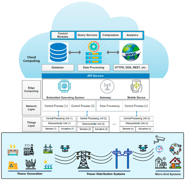
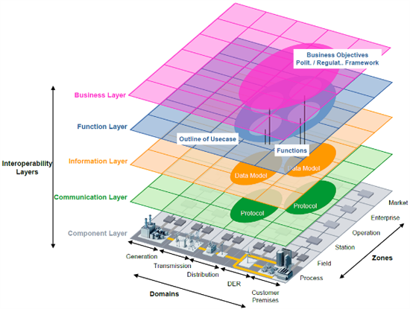
An Integrated Edge Compute Platform is needed to provide:

  • Integrated decision-support
  • Secure, zero-trust architecture
  • Monitoring, control, and visualization for resilience planning
A yellow-orange cloud icon with a check mark in the center.

Service Verification

  • Complex pre-production test environments
  • Manual service operational testing
A peach oval with four puzzle piece shapes in white within it.

Service Design

  • Long time to onboard VNFs
  • Highly complex Service Lifecycle Programming
A cloud icon black outline with a blue arrow pointing down from the center of it.

Service Deployment

  • Manual Service artifact release management
  • Error prone Service deployment
  • Manual ready for service testing
A red-orance icon with a cloud shape and a magnifying glass shape overlying it. Inside the magnifying glass is a horizontal line topped with vertical lines possibly representing a city-scape.

Service Maintenance

  • Highly manual Service, VNF, VIM fault resolution
  • Manual upgrade procedures across VIMs