
Engineer Research and Development Center - Environmental Laboratory
Risk and Decision Science Team
Compounding Threats
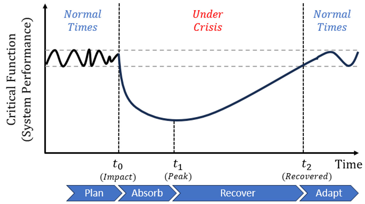
Quantifying resilience measures for interconnected compounding threats. ERDC has identified a need for multi-hazard approaches to risk and resilience modeling for compounding threats. The threats posed by hazards, whether natural or manmade, are typically addressed separately for modeling purposes. However, when these threats occur concurrently, they can have non-linear impacts on communities. An integrated approach is needed to quantitatively model the complex interactions between compounding threats for a collective response because an appropriate response to a single threat alone can worsen the impacts of the other threat.
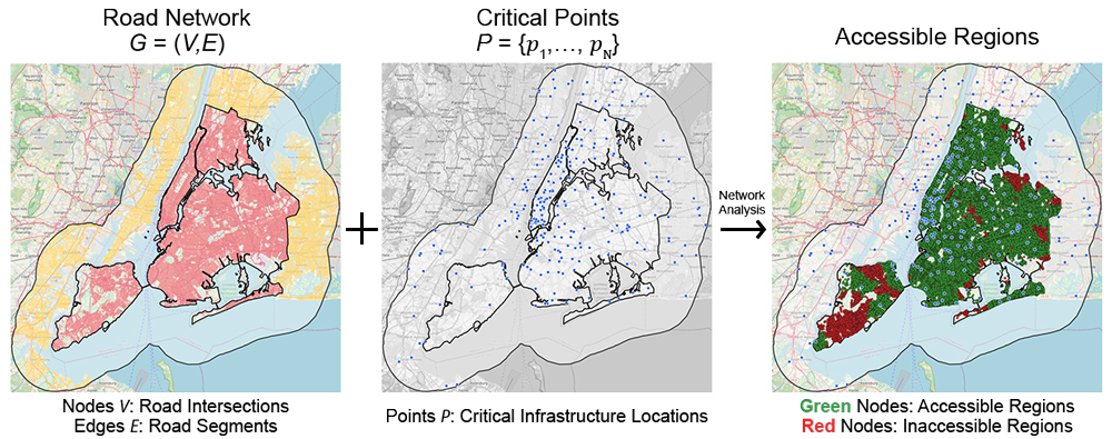
The goal of the New York City case study was to develop a tool to quantify resilience of the emergency management system. The system consists of the road network and locations of critical infrastructures. The critical function for the system is to provide accessibility of critical infrastructures. Disruptions of the system were modeled by degradation of road segments.
Critical Function (System Performance): How accessible are critical infrastructures by the road network?
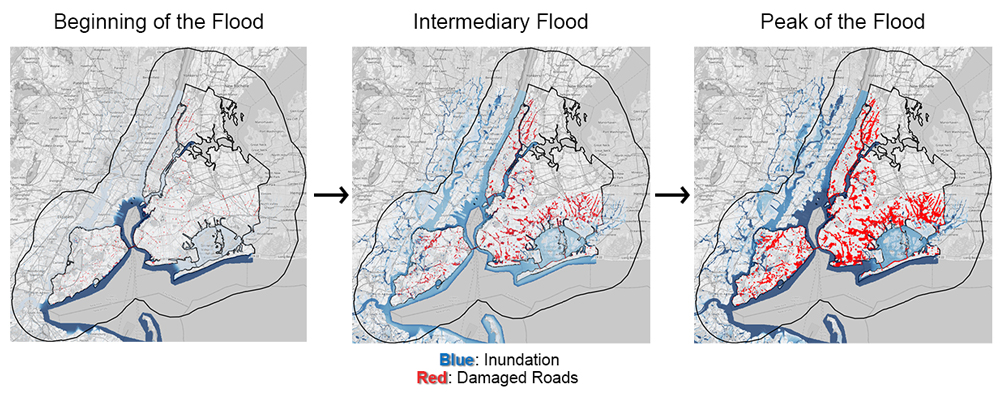
Threat Modeling: In rare cases, disruptions to New York City will occur and they will reduce the functionality of the city. These artificial or natural disruptions are modeled by degradation of road segments. The roads affected by disruptions are impassible, causing increase in travel time and reduction in accessibility.
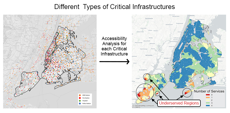
Crisis Modeling: Which regions lose emergency services?
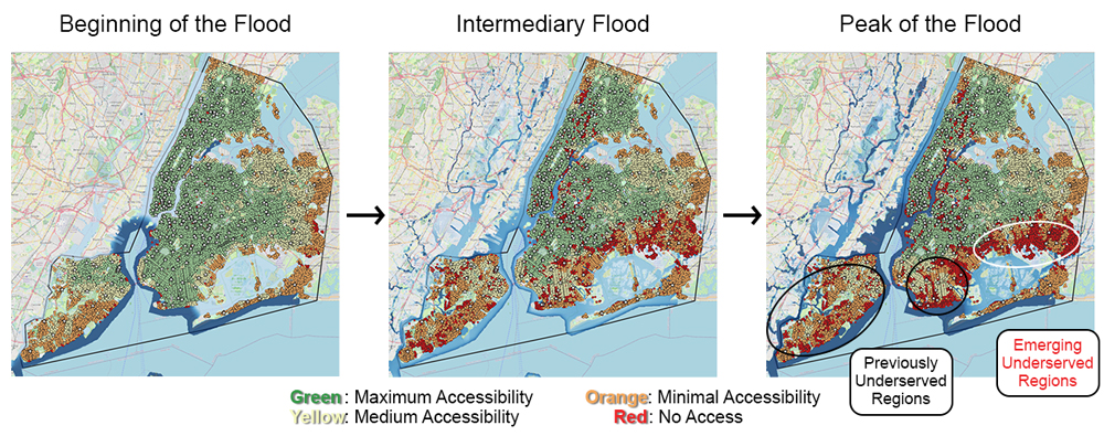
Under such crisis, we again measure the accessibility to critical infrastructures. Depending on the severity of the threat, we may see additional vulnerable regions or worsening of existing vulnerable regions. Analyzing the rate of degradation characterizes the absorption phase which is essential to quantifying resilience. Another essential piece in quantifying resilience is the recovery phase.
How to quantify resilience of the emergency management system. ERDC has identified a need for multi-hazard approaches to risk and resilience modeling for compounding threats. The threats posed by hazards, whether natural or manmade, are typically addressed separately for modeling purposes.
Under such crisis, we again measure the accessibility to critical infrastructures. Depending on the severity of the threat, we may see additional vulnerable regions or worsening of existing vulnerable regions. Analyzing the rate of degradation characterizes the absorption phase which is essential to quantifying resilience. Another essential piece in quantifying resilience is the recovery phase.
Quantifying resilience measures for interconnected compounding threats.